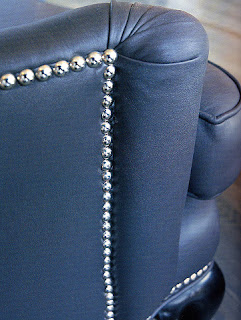
I’ve had a love-hate relationship with nailhead trim. One of the first places I actually took note of it was not in a good way. My Mom had hired a design firm in Phoenix in the early nineties to completely deck out their new home. The deal was, if my Mom didn’t like what they brought they would bring in something else, no obligations. I’m not so sure that was their idea with the window treatments because they had to be custom made. The window treatments were generally nice in every room except the kitchen where they selected a washed cotton in off-white that looked wrinkled but wasn’t and looked dirty but wasn’t… you get the idea. Anyway, they made cornice boards above really long windows… like 15-18’ long. Outlining the cornices (yes, more than one) were nail heads that looked and felt like plastic. It takes a lot of nail heads to cover 15 feet. And to add insult to injury, they put giant matching nail heads in the center of the cornice evenly spaced to create a tufted/ western sort of look. It was all a little too Vegas in the early 70’s for my taste. Luckily my Mom felt the same way. Out they went! I wish I had a picture for you.
Needless to say, nailheads haven’t been my detail of choice. But that could and should change. Lately (and in most cases since the aforementioned incident) I’ve seen many applications of nail heads that I love. I’ve seen the right fabric and nailheads bring and old upholstered piece right up to date. And the extra detail and emphasis for things like leather chairs and ottomans just goes to show you’re thinking about how to make things special.
Image above from Kelly Wearstler's book "Modern Glamour".
What a fabulous use of nailheads! Upholstered walls with a nailhead headboard built layered on top and the nailhead continues as almost a paneling motif in a very contemporary way. Ingenious- and by none other than Mary McDonald. While this application doesn’t necessarily feel casual to me, it is an intimate space and the nailheads work very well with the suiting fabric and the masculine feel. Notice the various different applications of nailheads on other pieces in the room- the bed and the stool and even the piece at the end of the bed. Image courtesy House Beautiful Magazine.
This is a chair from Gwyneth Paltrow’s entry hall featured in House & Garden. I like the minute nailhead detail on the base of the chair. A pinch of extra detail.
Sutherland teak outdoor with stainless nailheads. This side table from Shine Home uses a technique called “close nailing” to create a decorative pattern with the nailheads. This is becoming more common, but very frequently it is done to an otherwise forgettable piece of furniture to try to make something interesting of it. I like this side table application because it is small, movable, and strictly an accent piece. Wouldn’t it be fun for a party or outside on a summer evening?… I’m thinking of the effect of the shiny nailheads with flickering candlelight. Image courtesy House Beautiful Magazine.
For more nailhead ideas, history and application check out the February issue of House Beautiful.
Wednesday, January 23, 2008
Nailhead Trim
Posted by
Jenny Bova Associates
at
2:59 PM
![]()
Labels: details, Kelly Wearstler, Mary McDonald