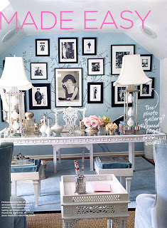
 Above: One of my most favorite offices of all time. I have clipped images for years and kept them in my binder files. For all I know this could be a month old (no, I have a little bit of a memory...) or two years old. I think it is from House & Garden and I'm fairly certain that it was done by Charlotte Moss. Everything about this office makes me want to sit down and dig in. Doesn't it look beautiful and livable? I mean, you could actually work here, which is not the case with many designs.
The offices shown here are both home and commercial offices. I think it's nice, when appropriate, for an office to show the occupant's personality and style. It is important for the space to function well and be beautifully designed. It's also important that the room, whether commercial or residential, maintains some connection and consistency with the other surrounding rooms.
Above: Mary McDonald designed this office. I love the simplicity of the color scheme: black, white, and that beautiful ice blue. Yet the room is filled with detail and detailed pieces. It's very easy and elegant. Image courtesy ?? Let me know if you know.....I hate to not give credit.
Above: Alessandra Branca does a beautiful job with her new office. Classic, yet crisp and clean. Again, a space you could really work in. I love what the black does to the space. Image courtesy of Traditional Home.  Above: Celerie Kemble's office. I positively love this desk. I want one exactly the same only slightly bigger. For practical matters I like a big work surface. Perhaps Kemble doesn't need a bigger surface based on the immaculate and well organized systems she has in place around this comfortable well-functioning space. Image courtesy of InStyle Magazine.
Monday, January 14, 2008
The Office
Posted by
Jenny Bova Associates
at
1:31 PM
![]()
Labels: Alessandra Branca, celerie kemble, charlotte moss, home office, office